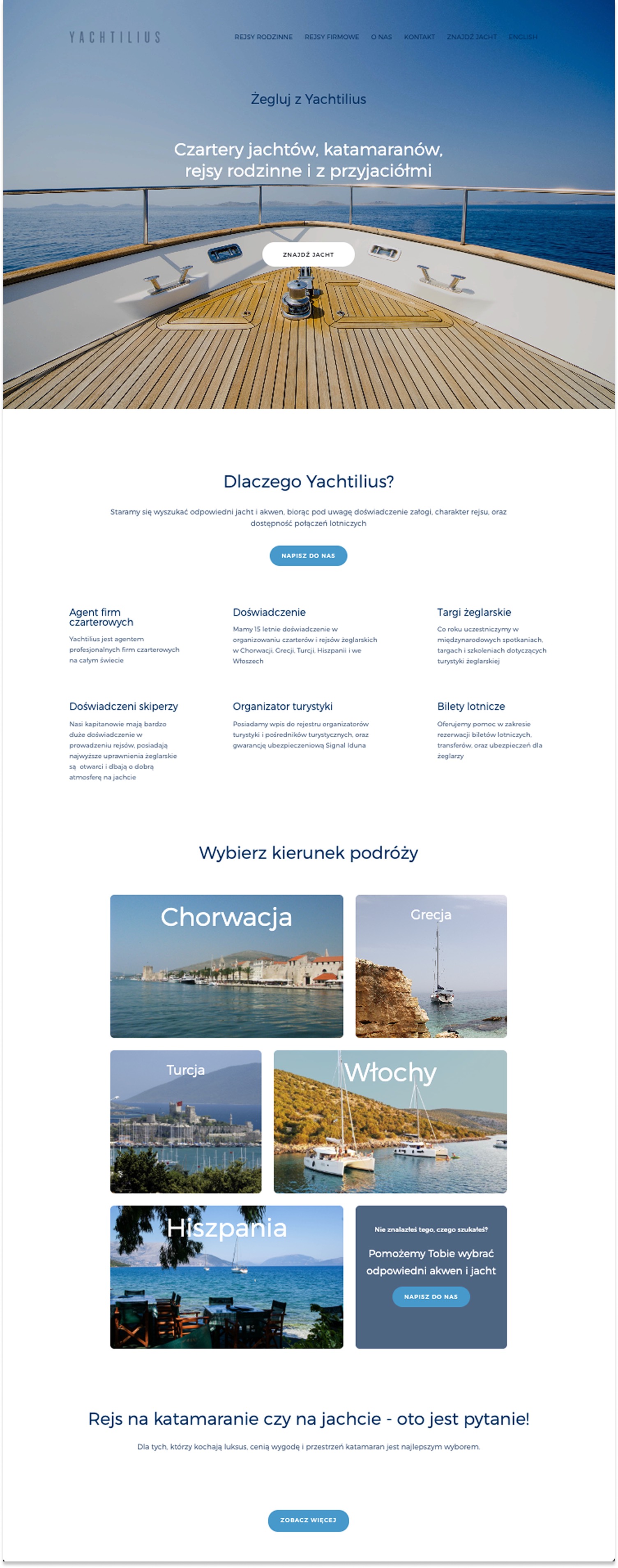
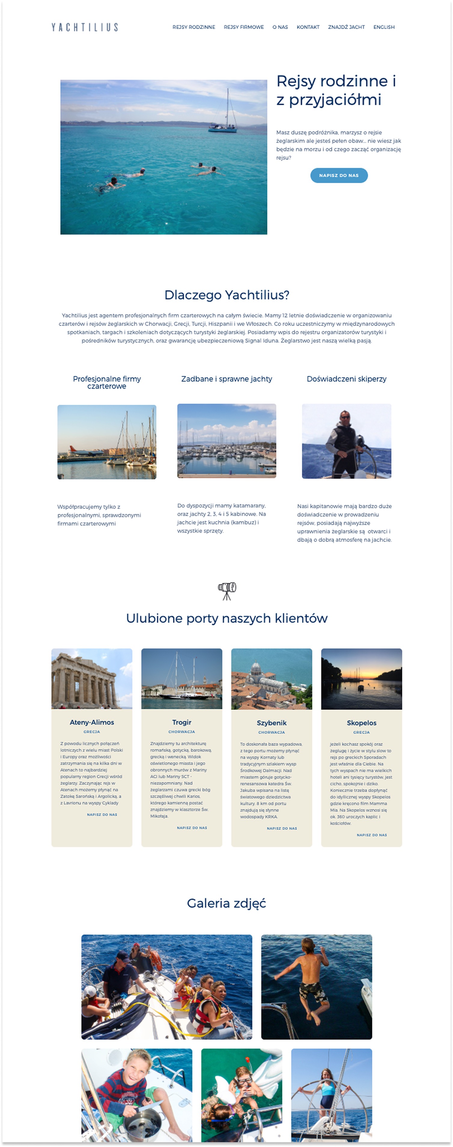
Landing Page
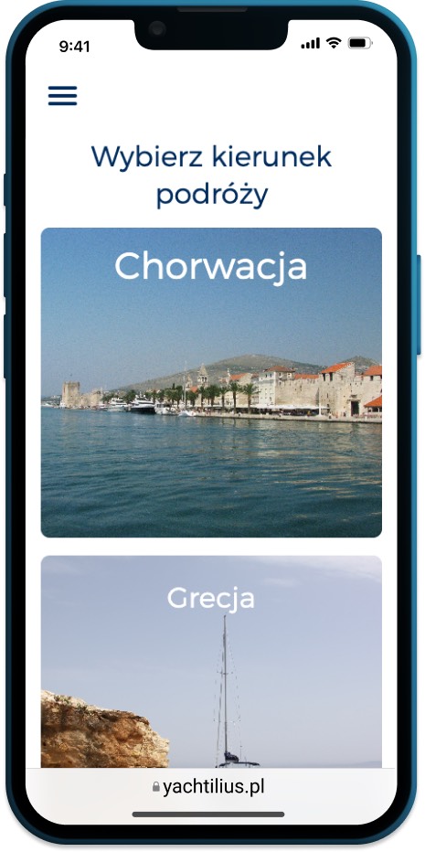
Tile-based navigation over a traditional list - charter clients browse visually. Large imagery and short descriptions do the selling.
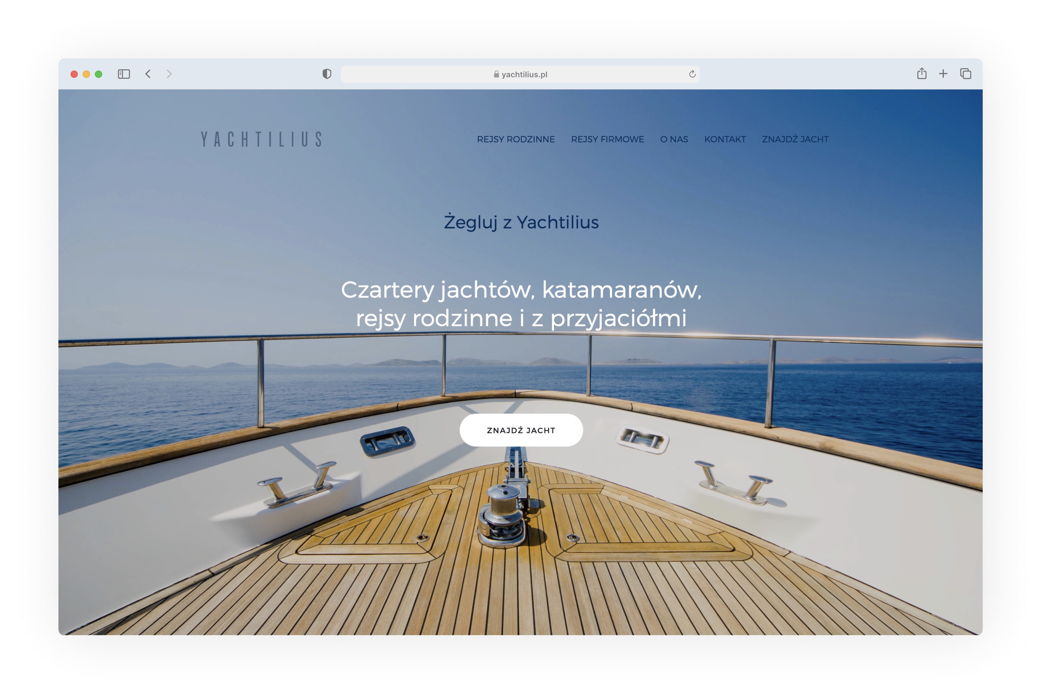
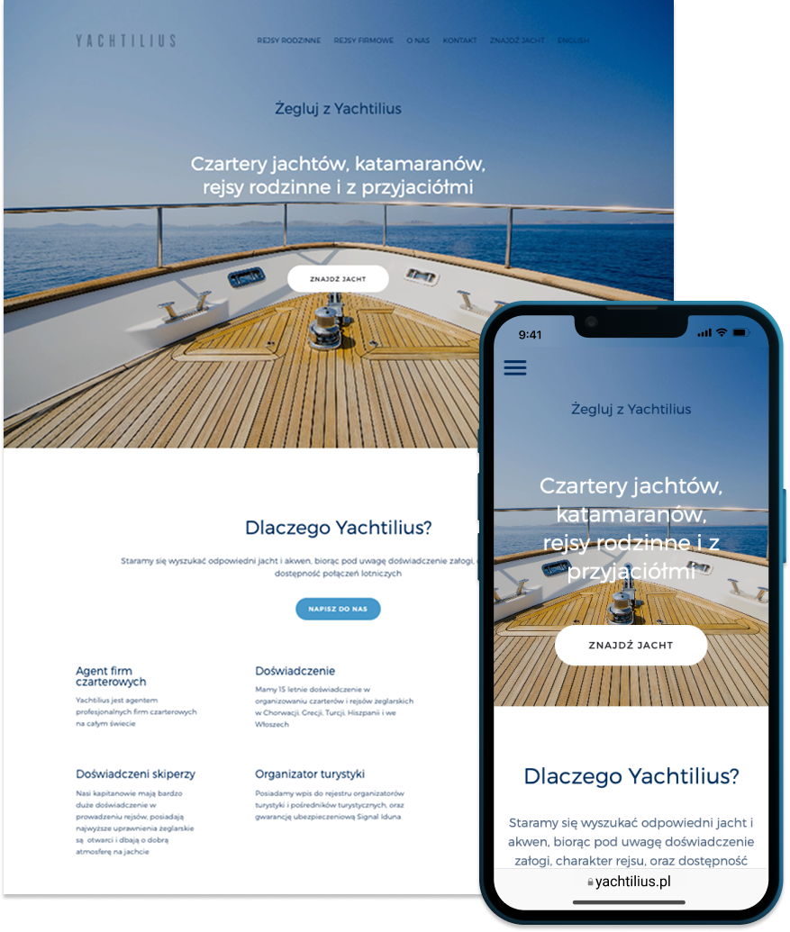
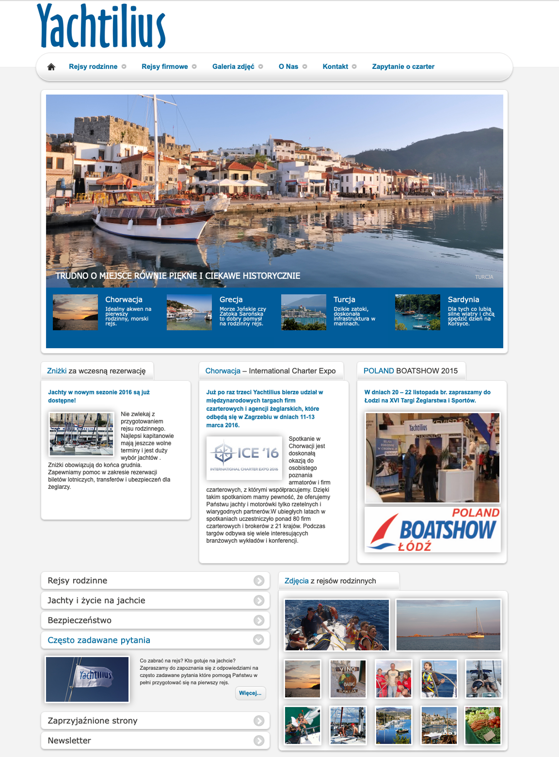
Landing page hero and navigation
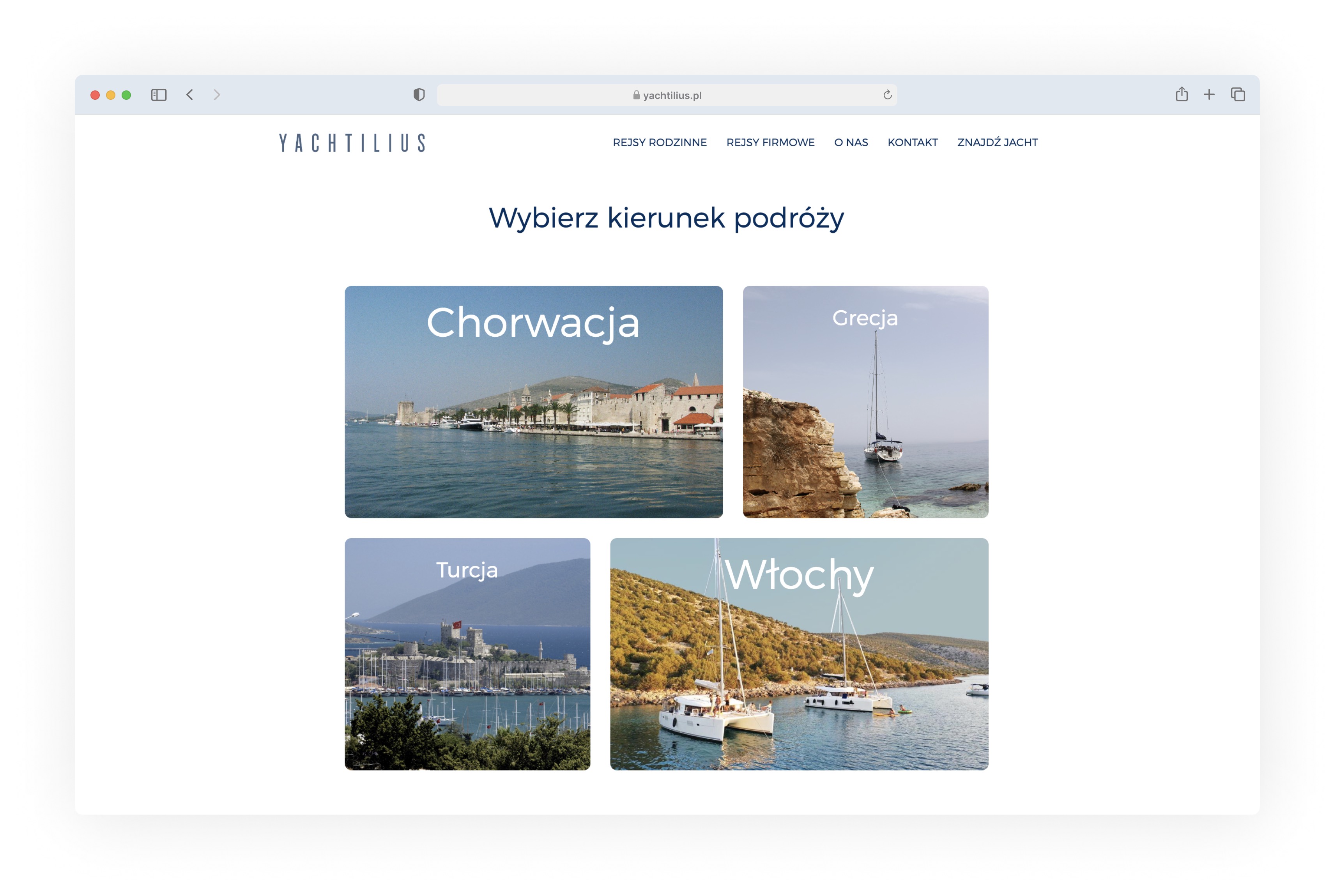
Destination tiles
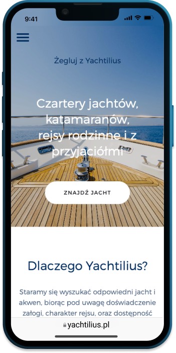
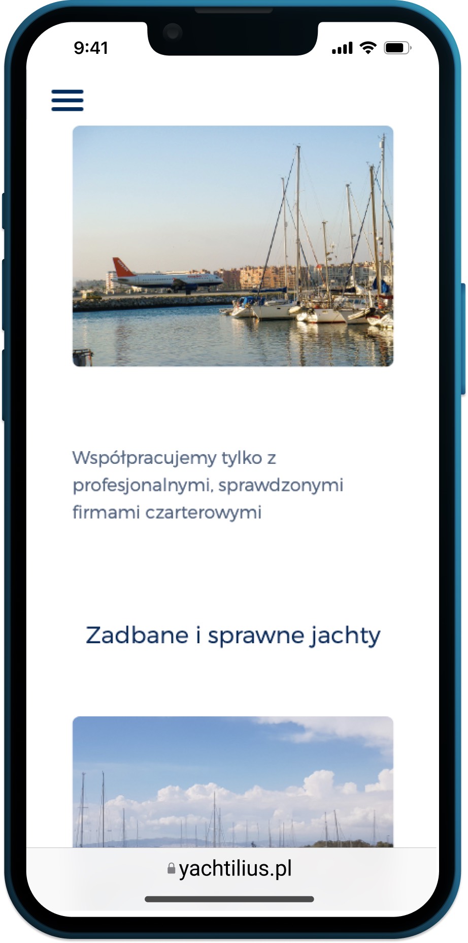
Mobile landing page
Destination Pages
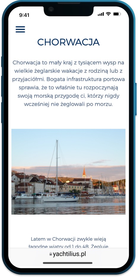
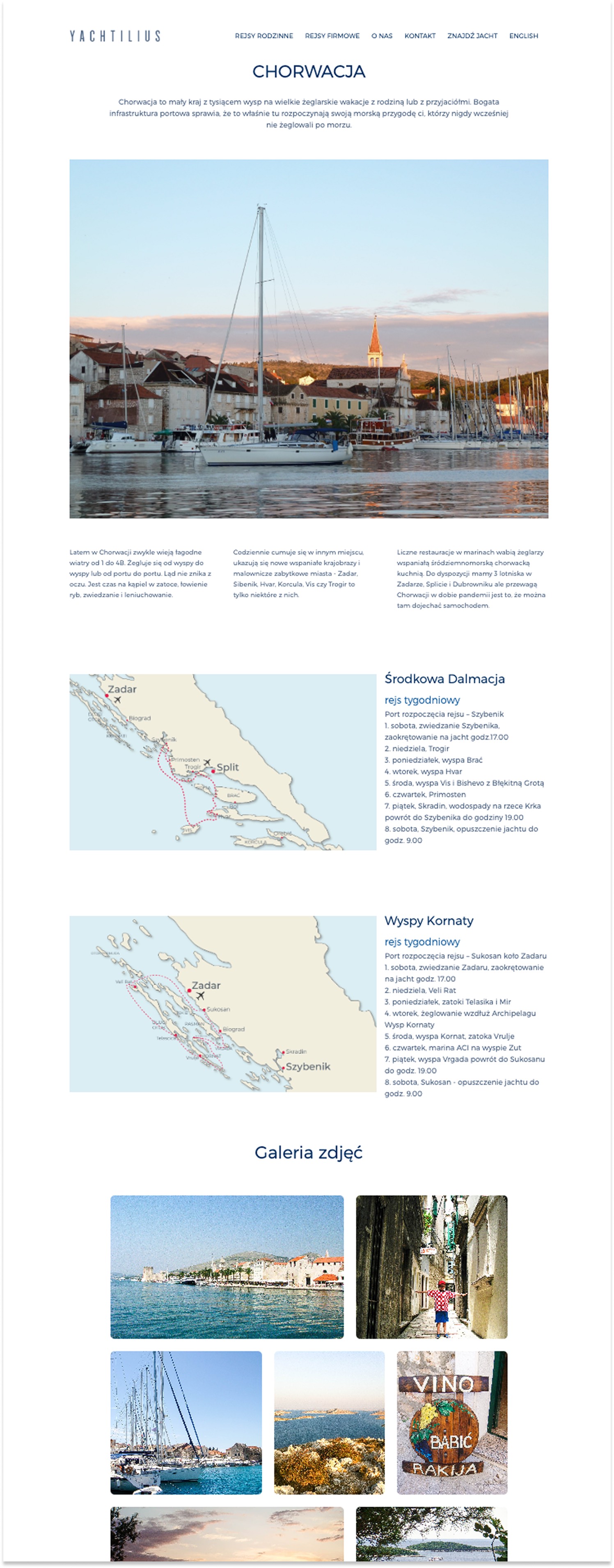
Each country page pairs sailing routes with local culture, cuisine, and attractions - giving first-time visitors enough context to picture the trip without a phone call.
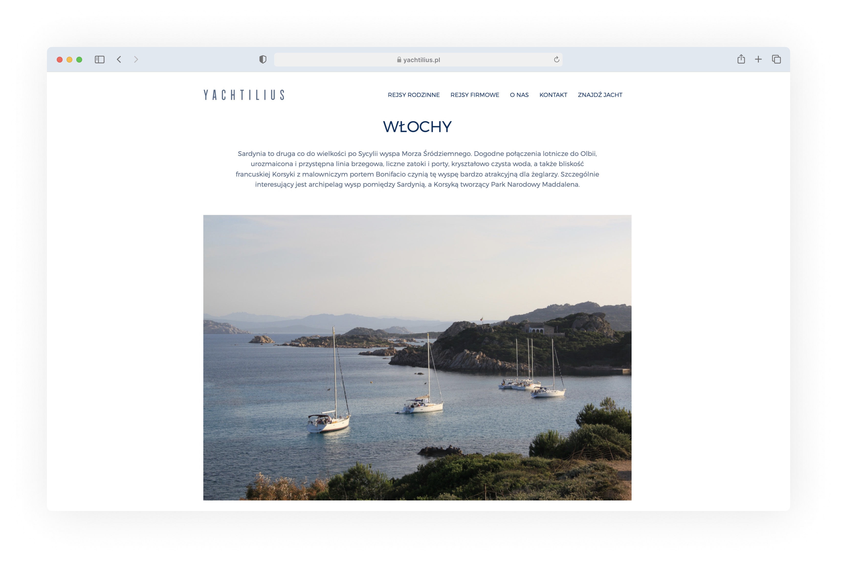
Italy destination page
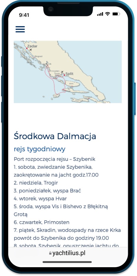
Day-by-day itineraries with interactive maps answer the "what does a trip look like" question upfront.
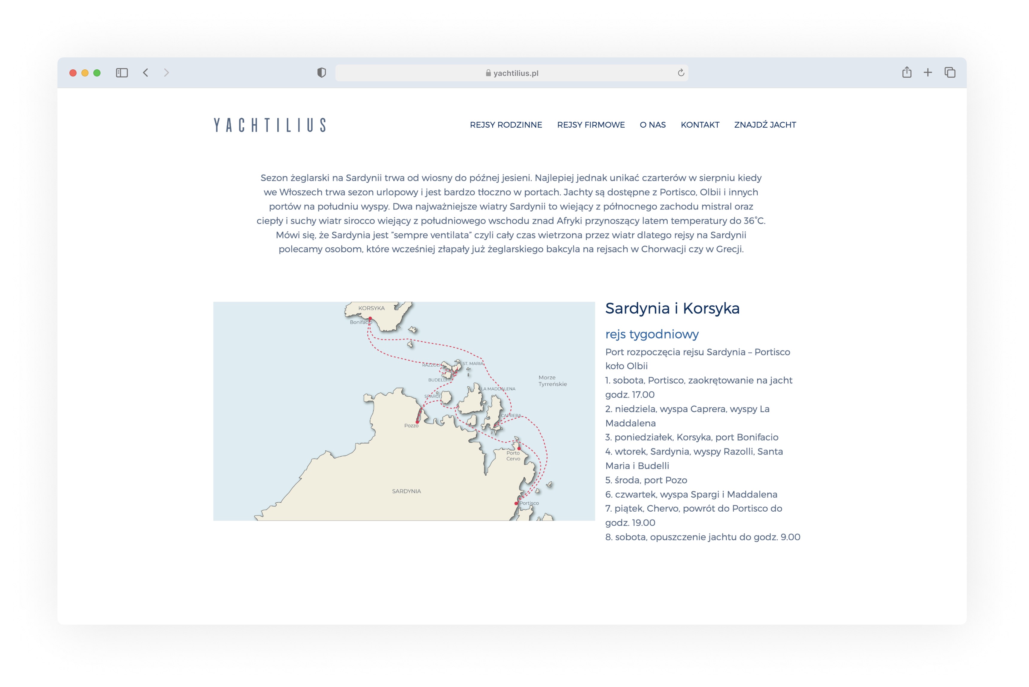
Tour route with sailing map
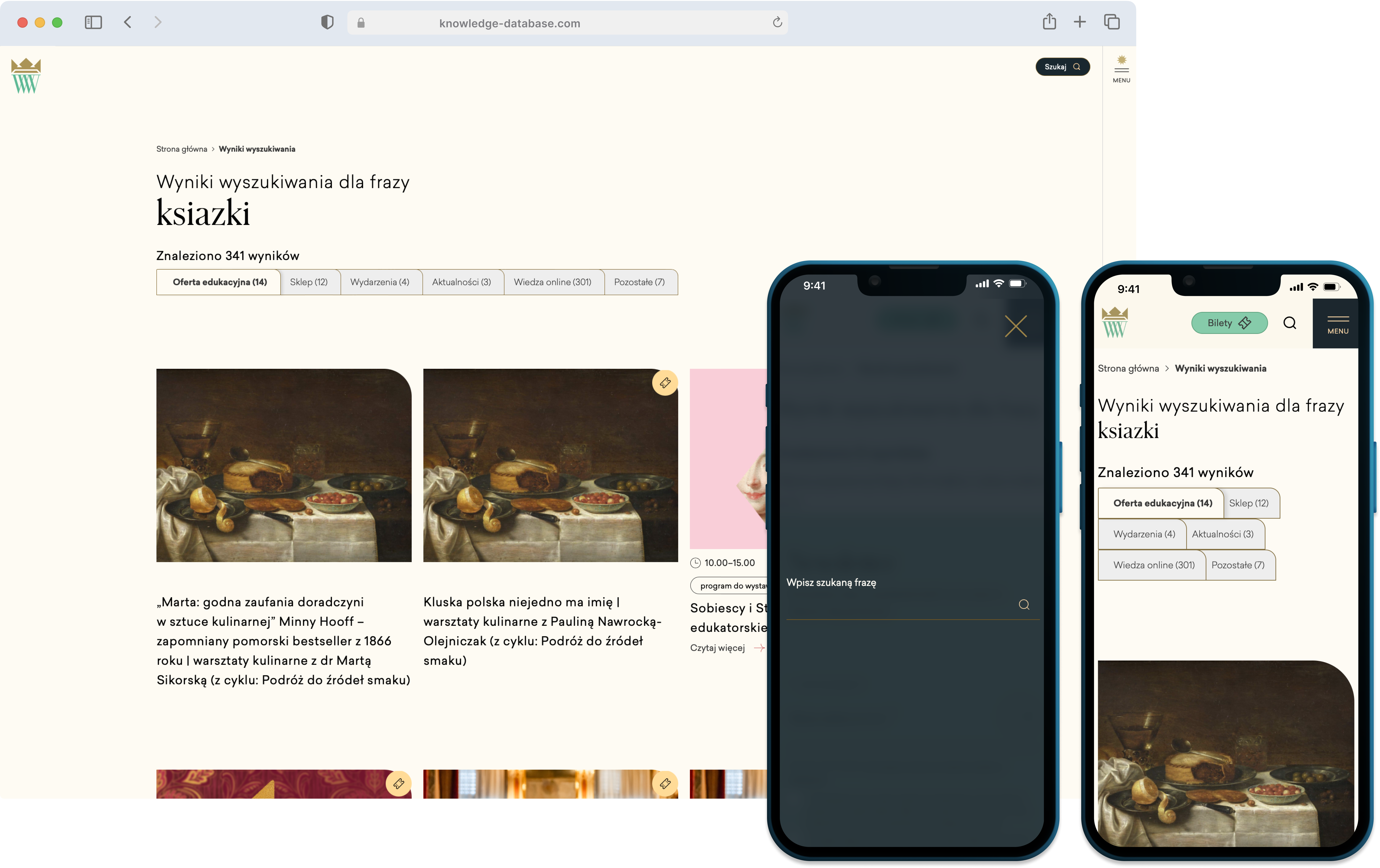
Mobile destination and tour views
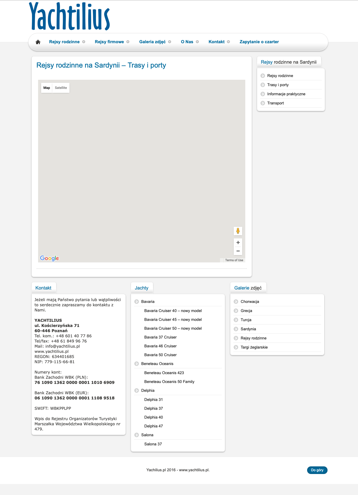
Supporting Pages
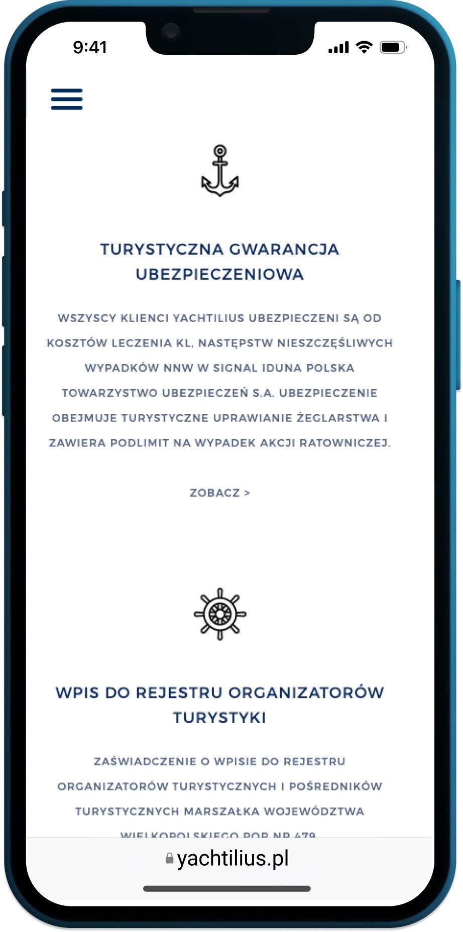
Clients often needed booking terms, payment details, and safety info before reaching out. Legal documents double as a tourist guarantee - required proof that the trip meets regulatory standards. This cut the back-and-forth the owner previously handled by email.
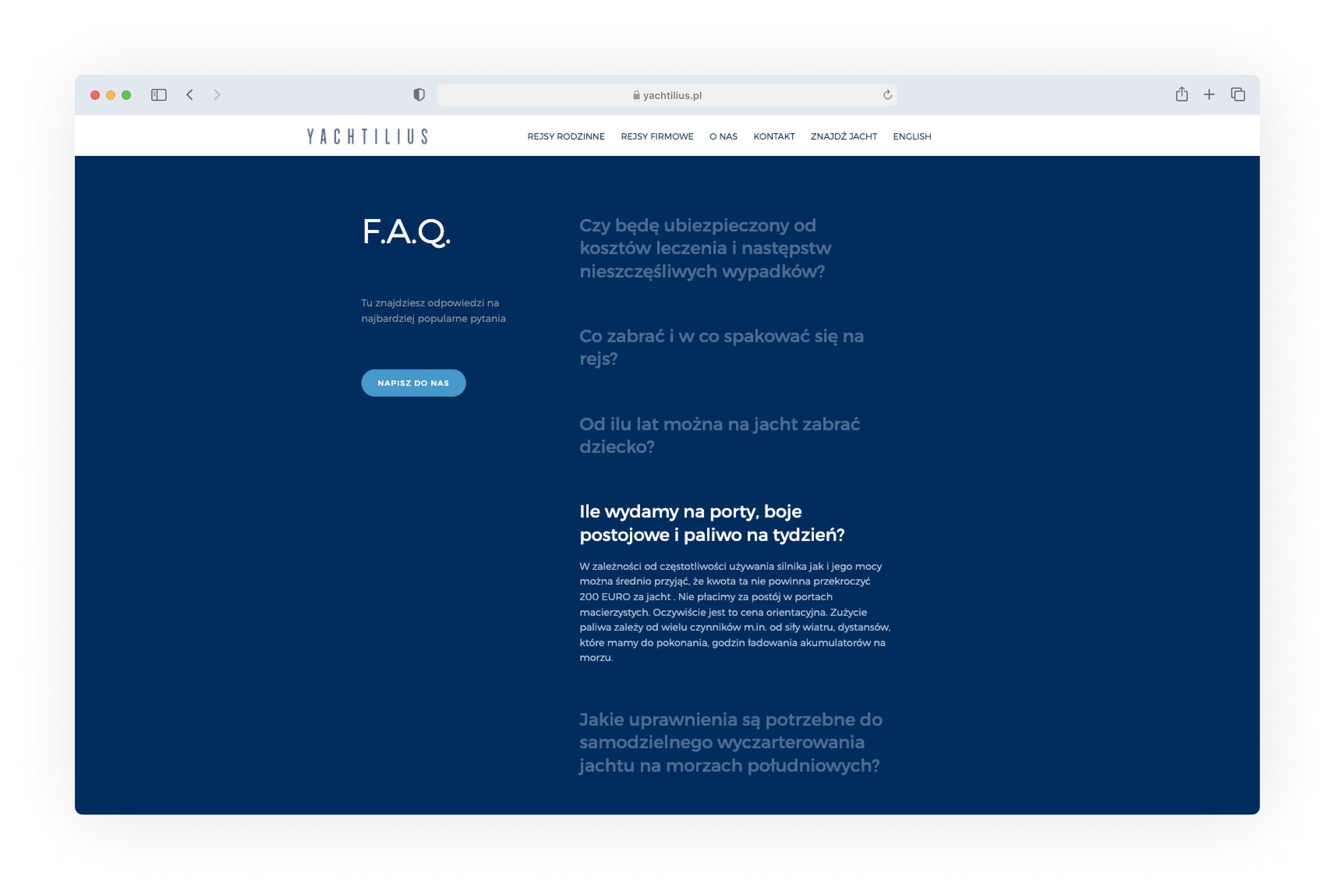
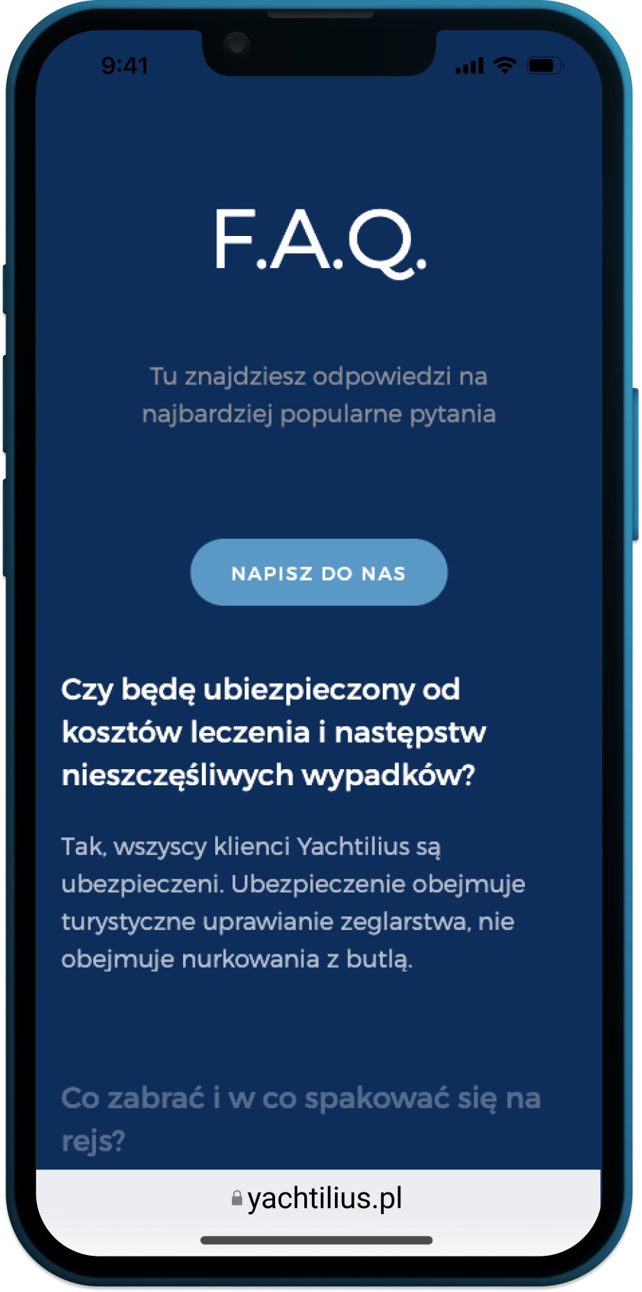
FAQ section
FAQ and legal documents
The owner's local expertise - invisible online until now - deserved a dedicated space. Curated port recommendations surface that expertise directly on the site.
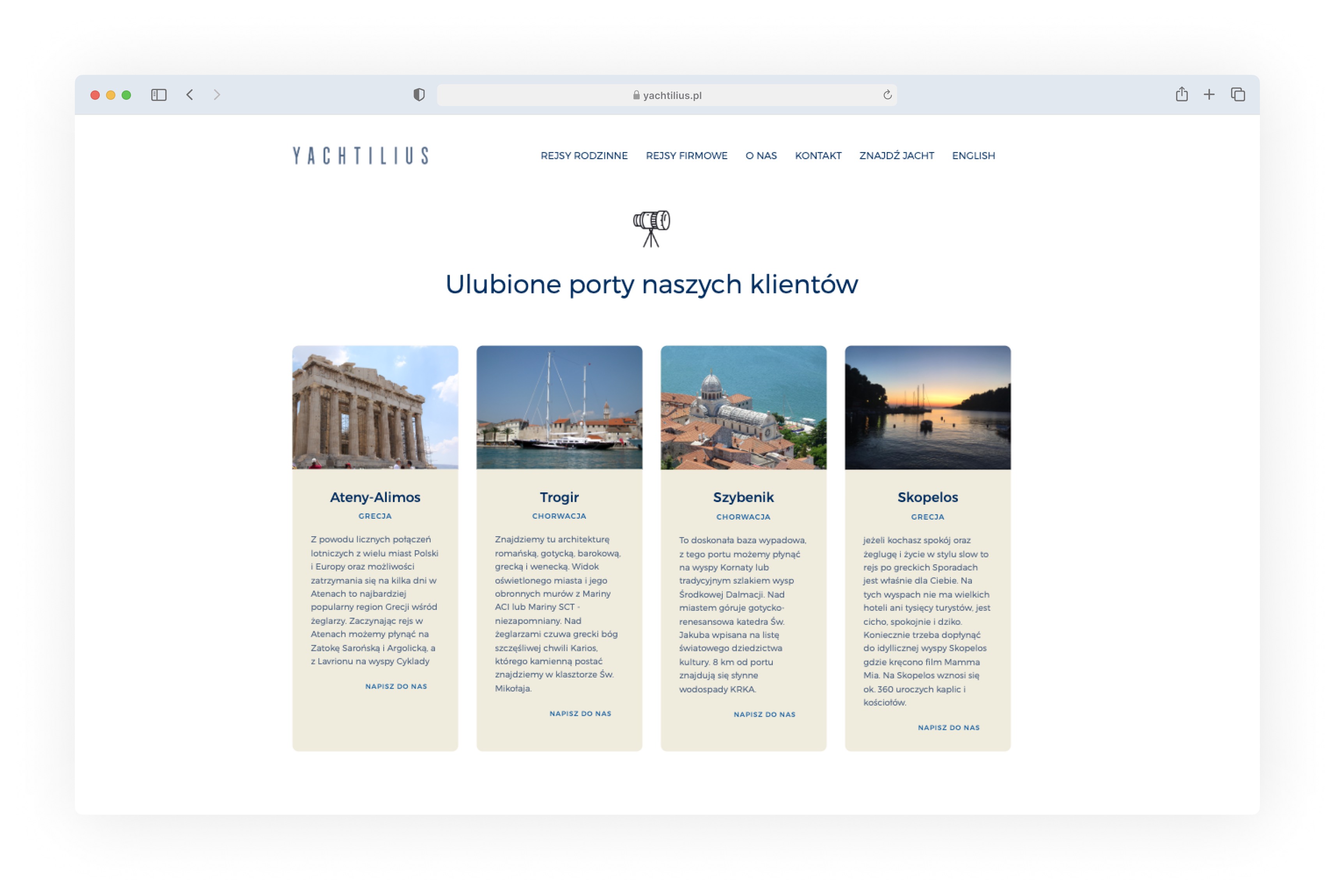
Curated port highlights
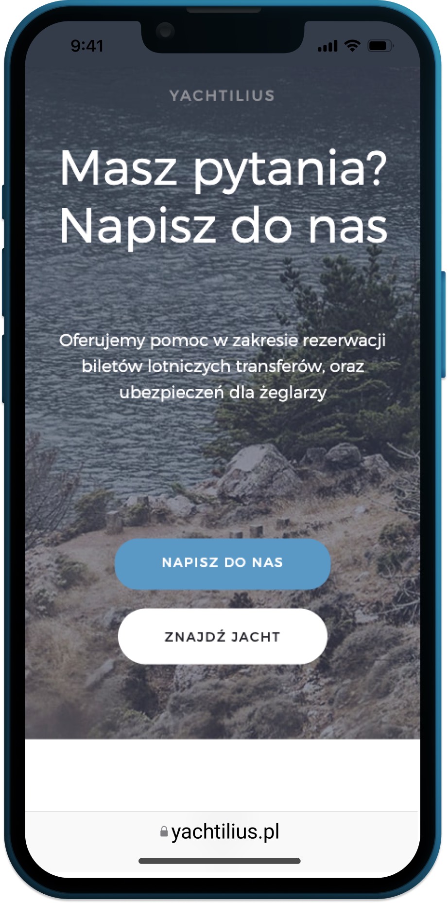
Contact and about pages