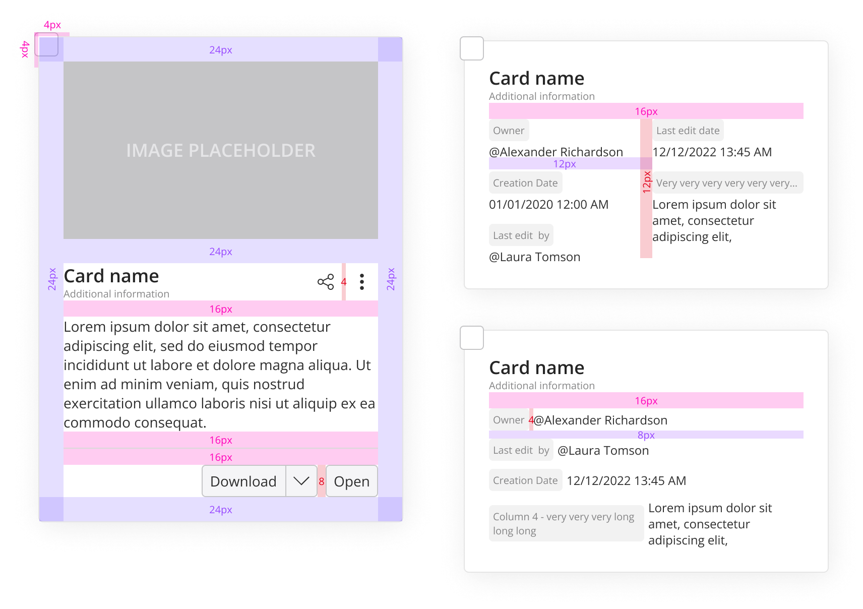
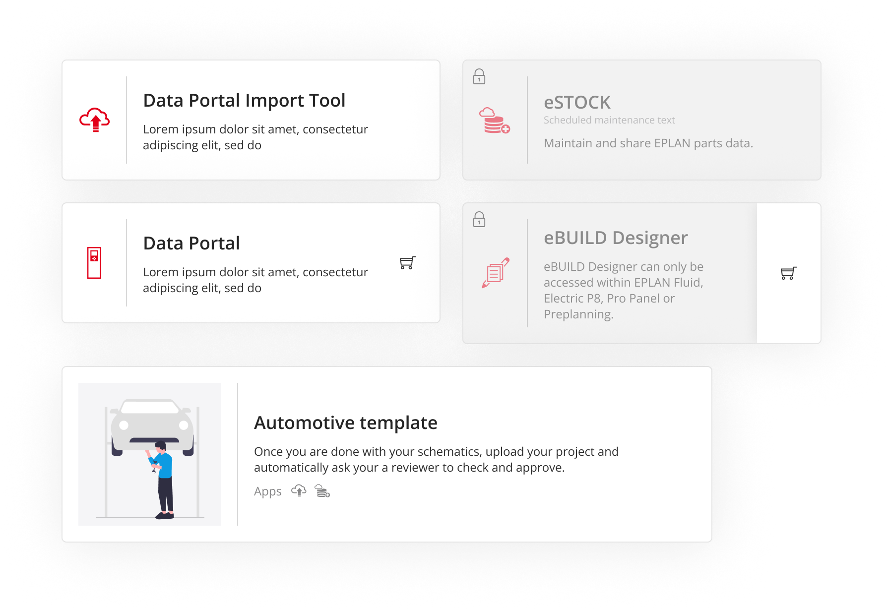
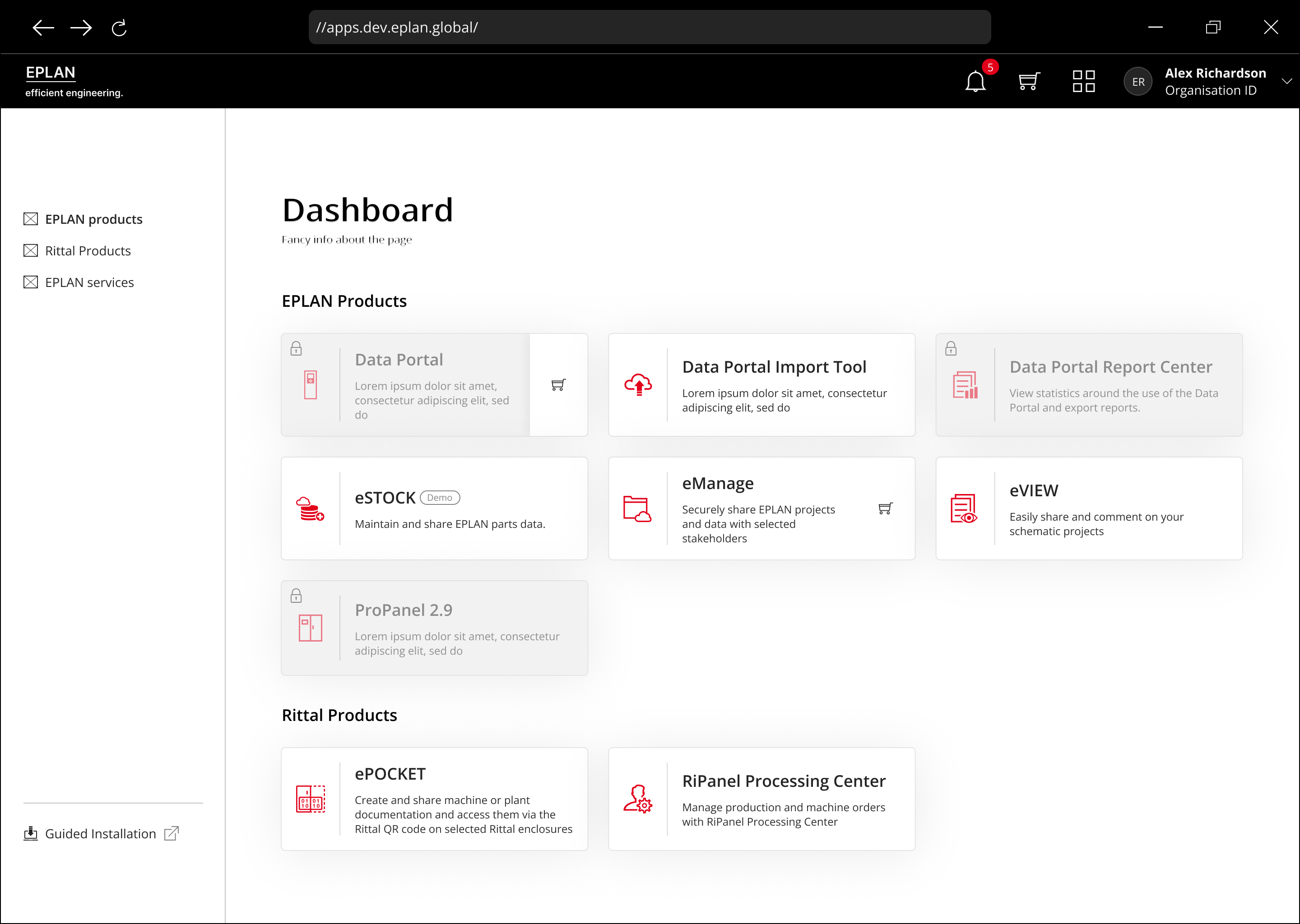
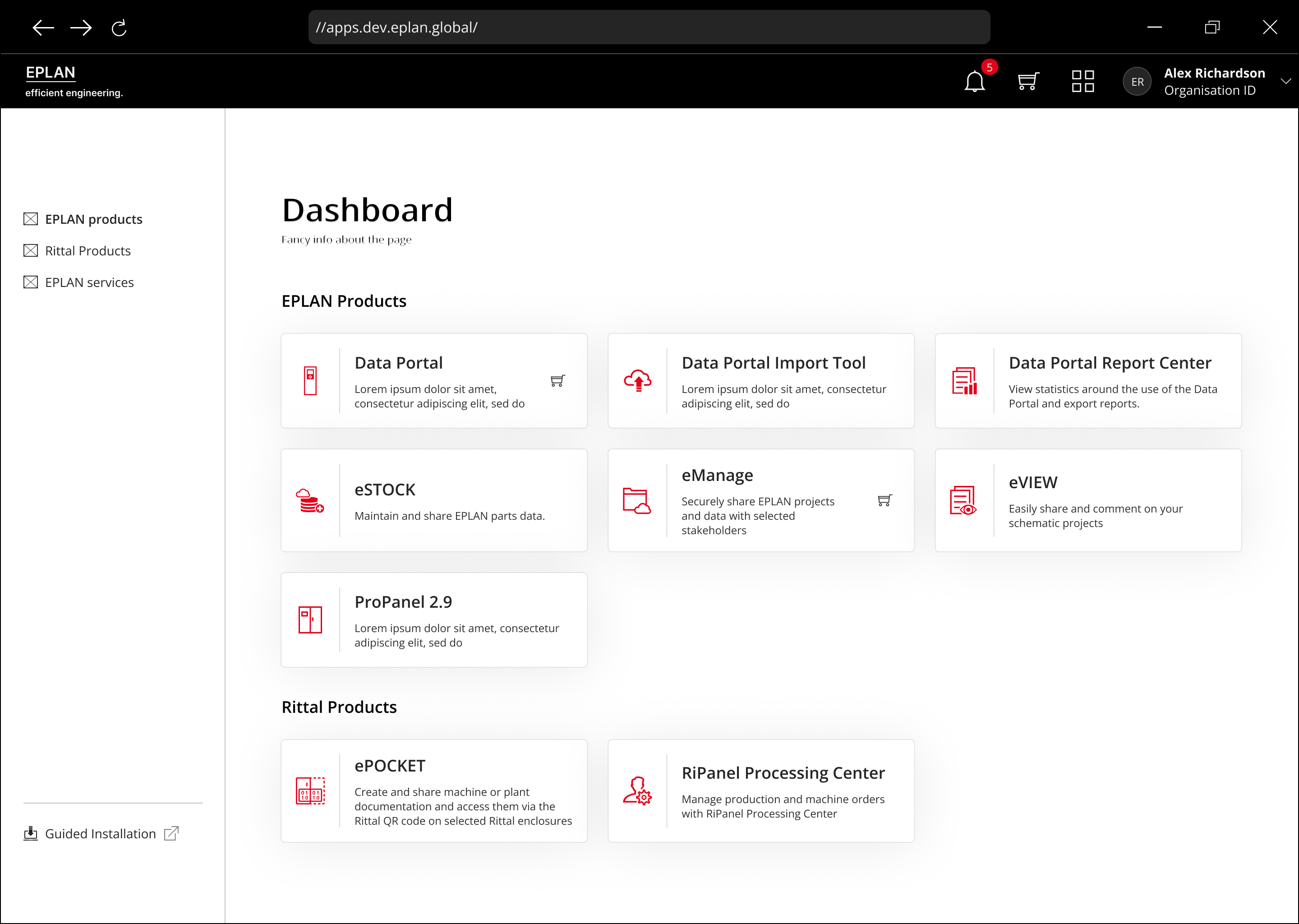
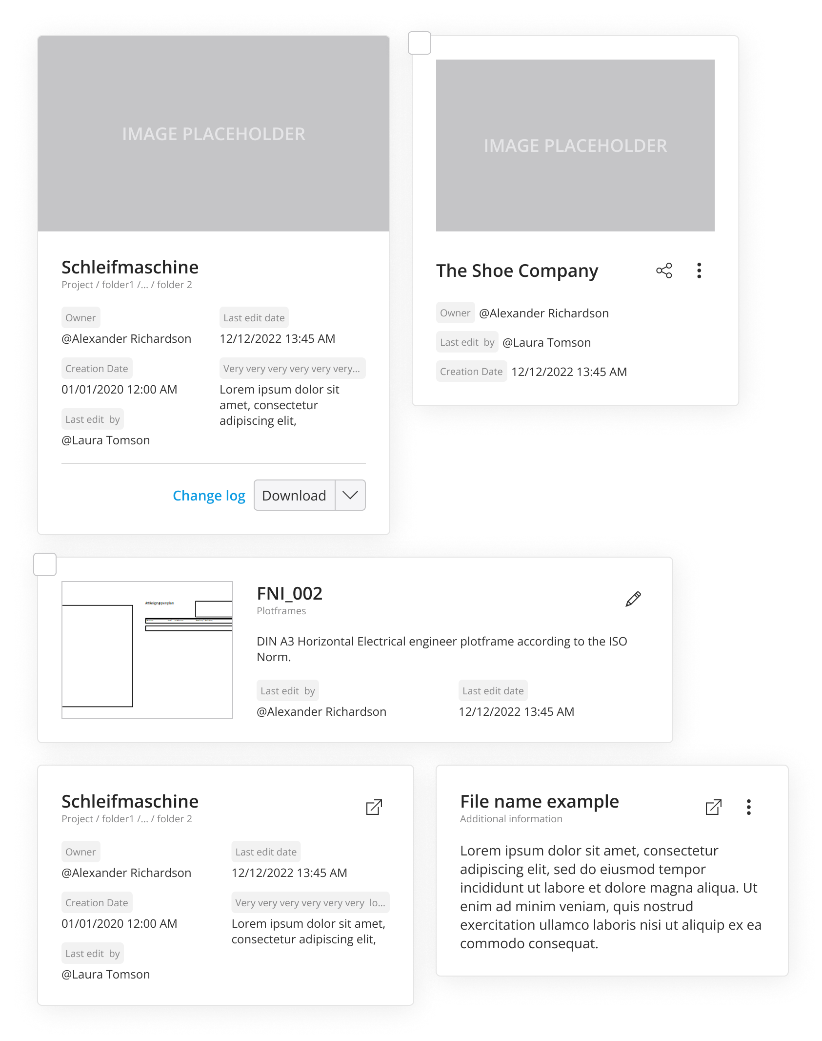
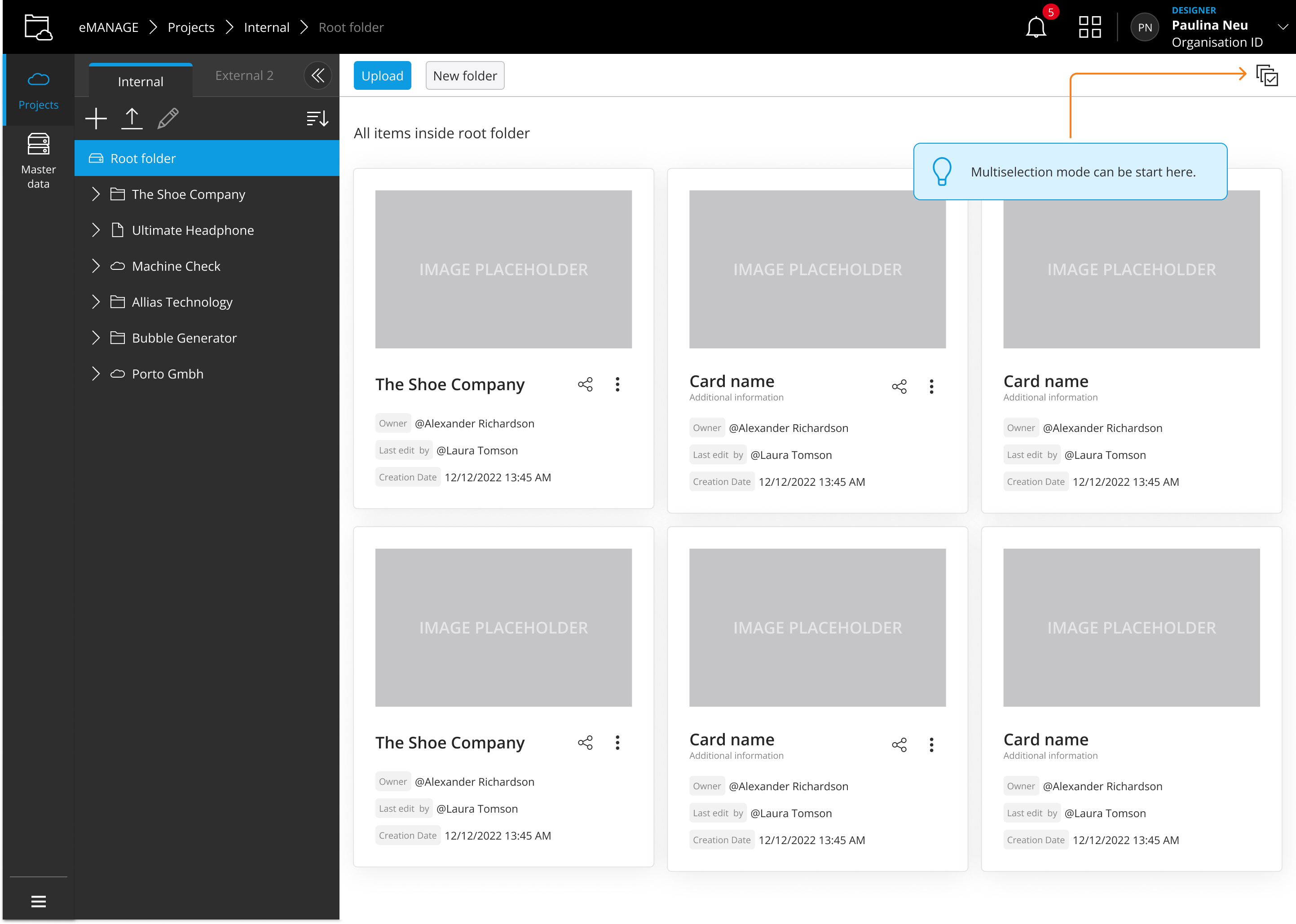
Challenge
Over 20 designers across multiple products were solving the same UI pattern differently, building their own versions of components with no consistency or documentation.
Role
End-to-end ownership: research across 6 designers and 9 products, component design, guidelines authoring, and engineering handoff.
Design Systems
UX Research
Interaction Design
Impact
Reduced container component variants to 2 standardized components, adopted across all 9 products. Gave every team a shared framework that cut design review debates around container patterns.
Duration
8 months