UX of Linguistic Interfaces

Researching how people search, navigate, and interact with NLP-powered systems · 7 min read
Challenge
NLP-powered components are embedded in almost every product we use - but standard UX methods were designed for visual interfaces, not systems whose core interaction happens through language. How do people actually behave when interacting with linguistic interface components?
Role
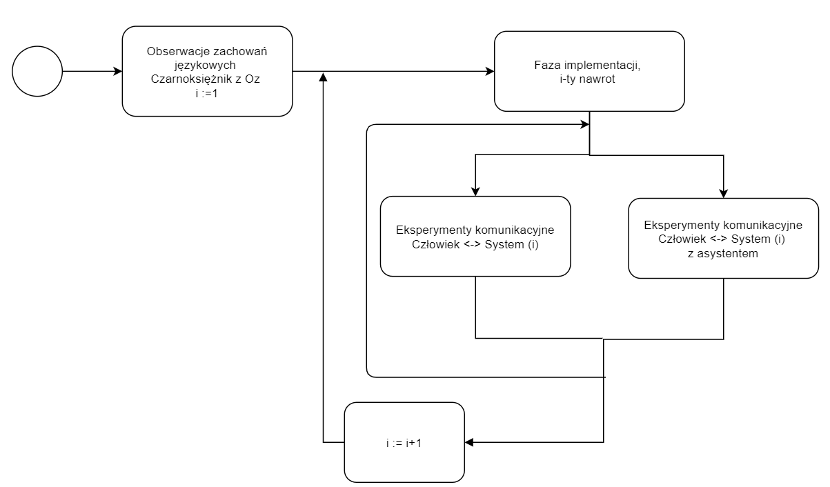
Sole Researcher & Designer - designed and ran the full study: survey creation, participant recruitment, usability test facilitation, Wizard of Oz sessions, and data analysis.
UX Research Usability Testing Survey Design Data Analysis
Impact
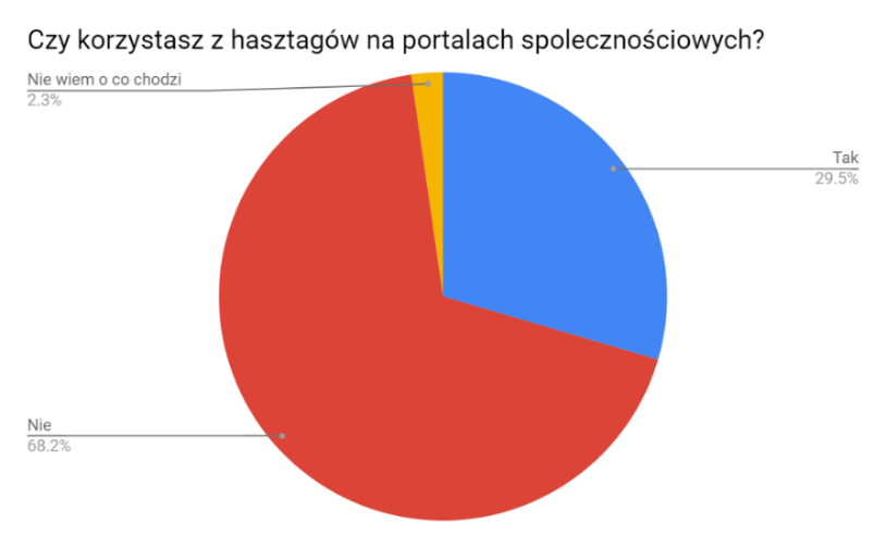
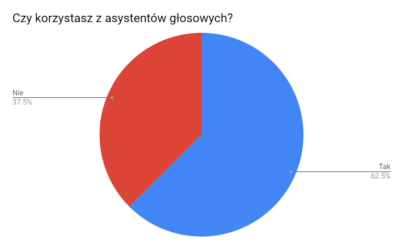
5 actionable findings and 4 design principles for linguistic interface UX, validated across 3 live systems with 88 survey respondents and 19 usability test participants.
Timeline
2020 · ~6 months · Master's Thesis, Adam Mickiewicz University, Intelligent Systems
Pasaż Wiedzy Wilanów — the primary system tested

The Challenge

NLP-powered components - search bars, tag clouds, voice assistants, auto-translate - are embedded in almost every product we use daily. Yet standard UX testing methods were designed for visual interfaces, not for systems whose core interaction happens through language.

I set out to answer two questions:
  • How do people actually behave when interacting with linguistic interface components?
  • Can we adapt established UX methods to evaluate these systems effectively?
This thesis bridges UX research, cognitive psychology, and NLP - developing a reusable methodology for evaluating systems where language, not pixels, is the primary interface.

Research at a Glance

88
survey respondents
3
systems tested
19
usability test participants
2
languages (PL & EN)

Research Process

I designed a two-phase mixed-methods study grounded in ISO 9241 human-centred design principles and insights from cognitive and social psychology.
01
Large-Scale Survey
88 respondents across Polish and English groups, exploring everyday habits with search, hashtags, machine translation, and voice assistants.
02
In-Depth Interviews
Selected participants for 30-minute deep interviews to uncover motivations behind their survey answers.
03
Usability Testing
Task-based tests on three real systems with controlled test group conditions across 3 rounds of testing.
04
Wizard of Oz Sessions
I acted as a hidden assistant during tests to reveal features users had missed, uncovering hidden usability gaps.
Extended Wizard of Oz model — researcher acts as hidden system assistant
Extended Wizard of Oz model adapted for linguistic interface testing

Systems Under Study

I selected three real-world systems that each represent a different approach to linguistic interface design - from text-based semantic search to visual tag navigation.
Pasaż Wiedzy Wilanów
A knowledge portal about Polish Baroque culture featuring a semantic search engine, a thematic tag cloud, category-based navigation, and article-level text hashtags. I ran three rounds of testing here with user groups under different search constraints.
IKEA
Selected for its visual tag-based navigation system. Product categories are presented as graphical hashtags (image tiles), giving users a visual browsing path as an alternative to the traditional search bar.
Fragrantica
A fragrance knowledge portal with rich graphical tag filtering - scent notes, accords, and seasons displayed as visual icons. Chosen to compare graphical hashtags against the text-only hashtags tested on Pasaż Wiedzy.
System Search Bar Text Tags Visual Tags Tag Cloud Auto-suggest
Pasaż Wiedzy
IKEA
Fragrantica
Scroll to explore
Pasaż Wiedzy Wilanów — tag cloud, search bar, and category navigation
Pasaż Wiedzy — text hashtags, tag cloud, and semantic search
IKEA visual category navigation
Fragrantica graphical scent note tags
IKEA visual category tiles vs Fragrantica graphical scent tags — the core comparison driving the "visual > text" finding

Test Design: Controlled Search Conditions

On Pasaż Wiedzy Wilanów, I divided 9 participants into test groups with progressively restricted access to the search bar - forcing users to explore tag clouds, text hashtags, and category navigation they would normally ignore.
G1–G2
Limited Search
One search allowed (single keyword or multi-word phrase). Users adapted quickly, relying on suggested articles and the sidebar tag cloud. Average session: 7–10 min.
G3
No Search Bar
No search bar access at all. Sessions averaged ~30 min. Two participants abandoned the task entirely; others reported high frustration.
G4
Unlimited Search, No Suggestions
Full search access but the "related articles" list was disabled. Users only discovered text hashtags under articles after several minutes.
WoZ
Wizard of Oz Extension
During post-test interviews I revealed hidden features as a "system assistant" - most commonly the auto-suggest and tag-cloud sidebar.
Text hashtags under articles — easily overlooked by users
Suggested articles sidebar — users' preferred navigation tool
Text hashtags under articles (left) went unnoticed, while suggested articles (right) became users' preferred tool

Key Findings

Search habits are deeply ingrained
Most users default to typing a single keyword into a search bar. 68% of survey respondents reported never using text-based hashtags. Even when forced to use alternative tools, users gravitated back to keyword search as fast as possible.
68% of respondents don't use text-based hashtags
68% of survey respondents reported never using text-based hashtags
Visual tags outperform text tags
Users on IKEA and Fragrantica engaged with graphical hashtags significantly more readily than with the text hashtags on Pasaż Wiedzy. Graphical tags felt like "browsing" rather than "searching" - a mental model users were more comfortable with.
IKEA visual product carousel with tag-based tabs
Fragrantica advanced visual tag search
Graphical tags on IKEA and Fragrantica engaged users far more than text-only hashtags
Tag clouds are powerful but unintuitive
In interviews, users acknowledged that the thematic tag cloud expanded their search results meaningfully. However, they described it as "not visible at first glance" and "complicated for multi-tag queries." Better visual presentation was the top request.
Voice assistants: trusted for small tasks, not high-stakes ones
62% of respondents use voice assistants, rating satisfaction at 4/5. But during interviews, none said they would trust a voice assistant with financial tasks like paying bills or booking flights - fear of error consequences was the main barrier.
62% of respondents use voice assistants
62% use voice assistants regularly, but none trusted them for high-stakes tasks
Machine translation: widely used, moderately trusted
~70% of respondents use translation services, with Google Translate dominating. Average satisfaction was only 3/5, indicating a trust gap despite heavy usage.
Translation satisfaction peaks at 3 out of 5
Translation satisfaction peaks at 3/5 — widely used but only moderately trusted

Design Implications

NLP features don't fail because the technology is bad - they fail because the interface doesn't make them discoverable or trustworthy. Based on the findings, I outlined four principles for designing systems with linguistic competence modules:
01
Make NLP features visible
Tag clouds, auto-suggest, and related-content panels need prominent visual placement. If users don't see it in the first 10 seconds, it doesn't exist for them.
02
Prefer visual over text for tags
Graphical representations of categories and tags lowered the barrier to use. Design tags as browsable visual elements, not text-only links.
03
Build trust incrementally
Voice assistants and translation tools are used daily but not fully trusted. Show provenance, confidence levels, or "why this result" to build user confidence.
04
Adapt UX methods for language
Standard usability testing misses linguistic interactions. Combine it with Wizard of Oz, controlled search constraints, and post-test interviews.

Reflection

What I Learned
This project shaped how I think about UX research. Working as a sole researcher across survey design, test facilitation, and data analysis taught me to plan rigorously while staying flexible - when Phase 1 survey data revealed surprising hashtag usage patterns, I redesigned Phase 2 to investigate graphical vs. text tags specifically.

What I Would Do Differently
I'd invest in eye-tracking equipment for richer behavioural data, and I'd run a follow-up study with A/B-tested tag cloud redesigns to validate the design implications quantitatively. The research also foreshadowed a wave of conversational AI interfaces - the trust barriers I found with voice assistants in 2020 remain relevant as we design for LLM-powered products today.

Selected Work

Investment Hub
Making mutual fund investing simple for retail investors
Research Wireframing Prototyping Dev Handoff
Read case study
Investment Hub
Sailes Charter Identity
Building a digital home for a family-run sailing charter company
Research Brand Identity UI Design Launch
Read case study
Sailes Charter Identity