Product Principles & Patterns

When a design system alone doesn't guarantee consistent UX · 5 min read
Challenge
Dozens of recommendation placements across the shopping journey, owned by different teams and built from the same component library - yet users still couldn't tell why they were seeing what they saw.
Role
Led the process of defining and rolling out shared design principles and patterns for product recommendations - from synthesizing research into a first draft, through co-creation workshops with design, product and engineering, to embedding the finished patterns in the design system.
Design Principles Workshop Facilitation Design System Documentation
Impact
A shared decision-making framework now used across the recommendations domain - fewer debates started from zero, faster alignment on new placements, and a foundation the team is now extending to AI-assisted pattern creation.
Duration
~1 quarter to roll out · ongoing adoption
WHY Principle A compass for resolving design dilemmas - a decision rule. HOW Pattern A proven, repeatable solution to one specific problem. WHAT Component The piece of interface that implements the pattern.

The Problem

Recommendations at this scale aren't one feature - they're dozens of placements across the homepage, search, product pages, cart, and post-purchase, each owned by a different team but built from the same shared component library.

Having a mature component library didn't stop the experience from feeling inconsistent. Components give you visual consistency, not decision consistency - they don't tell you when to show a recommendation, how to explain why someone is seeing it, or how to balance what the user wants against what the business wants.
  • Dozens of placements, each able to ship independently
  • The same recommendation logic reused for very different user intents
  • No shared answer for "why is this module here, and why this content?"
Dozens
placements
3
disciplines aligned
4
shared principles
The same pain point kept surfacing in research, worded almost the same way every time: "Why am I seeing this?" When people don't understand why something is being shown to them, they stop trusting it - and no amount of component polish fixes that on its own.

Principle, Pattern, Component

Before writing a single rule, the team needed to agree on what we were actually building. "Principle," "pattern," and "component" were being used interchangeably - and that ambiguity was part of the original problem.
Principle · Why?
A compass that helps resolve a design dilemma. It's a decision rule, not a UI spec - it tells you how to think, not what to draw.
Pattern · How?
A proven, repeatable solution to one specific problem. It describes behavior: when it applies, and what it should do.
Component · With what?
The piece of interface that implements the pattern - the part that already lived in the design system before any of this work started.
Mature design systems document all three layers, not just the UI layer at the bottom. Ours, like most, only had that third one written down.

Building Principles Together

Principles that one person writes alone rarely survive contact with a real team - they needed to be co-owned from day one, by the people who'd actually have to apply them under deadline pressure. That shaped the entire process, not just the final wording.
What the first draft stood on
Before anyone in the room saw a draft, it had to stand on something more solid than opinion:
  • Promises already made to customers and sellers elsewhere in the product strategy
  • Prior usability research, including a dedicated study on recommendations across the purchase path
  • Third-party UX benchmarks for the category
  • Customer experience index data and competitive analysis
  • Learnings pulled from recent high-stakes launches
What the workshops were actually for
The draft then went into the room with four explicit goals - not just "give feedback":
  • Align everyone on how things actually worked today, before debating how they should work
  • Align on where the short- and medium-term strategy was heading, so principles wouldn't be obsolete in a quarter
  • Walk through the research and the first draft together, in the open, so no one was defending it alone
  • Leave with a v0.1 the room had actually argued into shape, not one person's opinion with a stamp of approval
From draft to shared practice
Draft
A first version built on the foundations above - something concrete enough to react to, not a blank page.
Workshops
Design, product and engineering challenged and rewrote the draft together, line by line.
Feedback
Iterated async and in person until the wording actually held up under scrutiny, not just in the room.
Shared
Moved into the design system, where the day-to-day work actually happens - not a deck no one reopens.
AI helped here too - not to write the principles, but as a sparring partner: synthesizing research notes, clustering recurring user complaints, and poking holes in early drafts before they reached the room. It sped up the synthesis. The workshops, and the disagreements inside them, are still what made the principles stick.

Principles for Recommendations

What the team agreed on, in four rules rather than forty:
User mission first
A recommendation answers what the user is trying to do right now - not just what's in stock or on promotion.
Personalization with nuance
We draw on history and preference, not just the current session - and content and format adapt to category and shopping mission rather than one template for everything.
Build trust
We explain why a recommendation is shown and give people a clear way to control or dismiss it.
Learn and iterate
We collect feedback continuously and check what's actually working, instead of treating a shipped pattern as finished.

Patterns in Action

Principles only earn their keep once they can resolve a real disagreement. A few examples from the rollout:
Pain point: "Why am I seeing this?" traced straight back to one principle - build trust. The pattern it produced turned a vague value into concrete, checkable rules: a primary label on every module, benefit-led language instead of generic headlines, and a link to both an explanation and a way to give feedback.
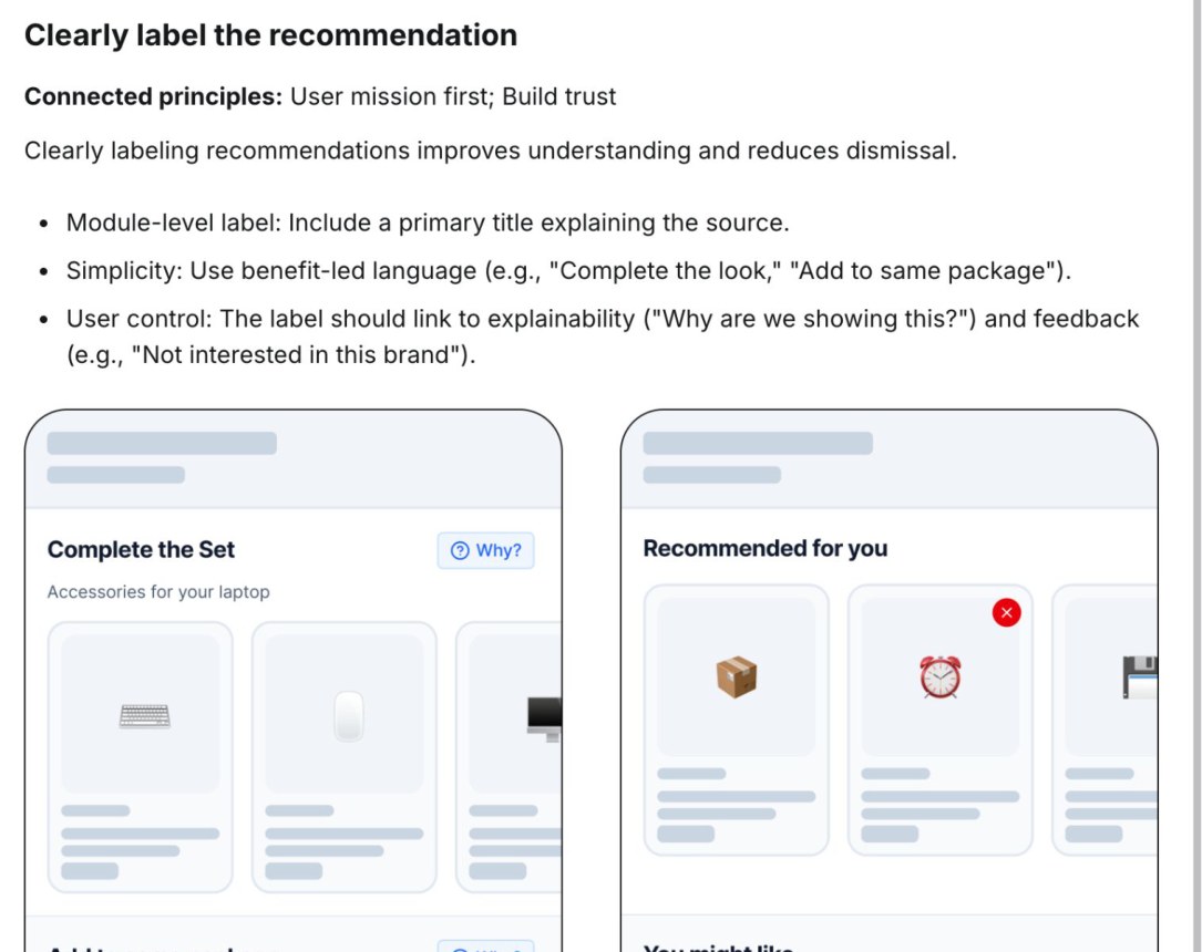
Pattern spec: clearly label the recommendation, with explainability and user control
Pattern: clearly label the recommendation
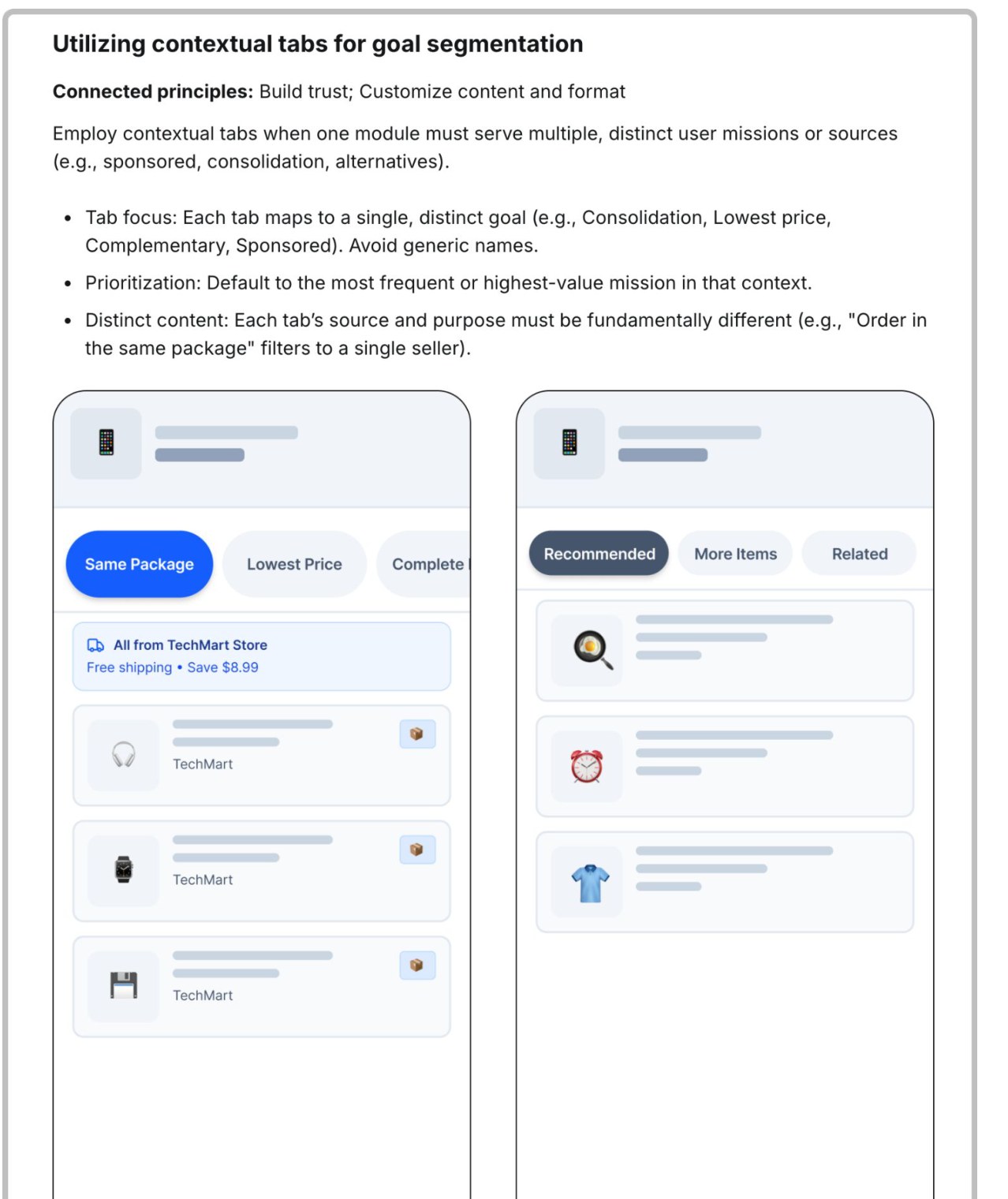
Pattern spec: contextual tabs for goal segmentation
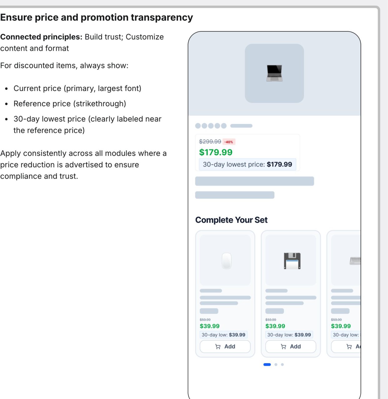
Pattern spec: price and promotion transparency
When one placement had to serve three goals at once - sponsored content, shipping consolidation, and alternatives - the pattern didn't tell the business "no." It said "how": segment by user goal with contextual tabs, each one mapped to a single, distinct purpose.

Some patterns exist because the law requires them, not because research suggested them. Price and promotion transparency - always showing the recent reference price next to a discount - gave the team solid ground to say "this one isn't negotiable" when it mattered.
Three patterns, three different reasons to exist: trust, business flexibility, and legal compliance
Not Designed in Isolation

I tried not to design these principles in a vacuum. The same underlying value shows up in other AI-driven parts of the product, even though the pattern that implements it looks completely different.
Build trust · in recommendations
We explain why a user is seeing a given recommendation, and give them a way to control or dismiss it.
Setting the right expectations · in AI features
We clearly communicate the source of information, its limits, and what the user should expect from the response.
Same value, two different products, two different patterns. Looking for that overlap kept the principles from becoming yet another siloed artifact.

Why Principles Die

Before this version worked, an earlier attempt at the same idea didn't. A few reasons principles and patterns quietly stop being used:
  • They live apart from the tools people actually work in, as a document nobody opens
  • They're too general to resolve an actual disagreement
  • They're too rigid, blocking valid business needs instead of showing a path through them
  • They have no clear owner, so they quietly stop being updated after a quarter
Keeping them alive meant putting them where daily work already happens, rather than one more place to remember to check. The finished set now lives directly inside the design system alongside the components that implement it.

AI now has a second role here too: helping draft new patterns consistent with the agreed principles as the recommendations surface keeps growing. AI proposes, a designer still validates every one before it ships - the principles are there to serve the product, not the other way around.
Results
Shared principles and patterns for product recommendations now live directly inside the design system, where day-to-day design and engineering work happens.
  • A common language across design, product and engineering, instead of each team defending its own interpretation of "good"
  • Fewer decisions restarted from zero for every new placement
  • Faster resolution when two teams' goals for the same placement conflicted
  • More consistent recommendation behavior across very different parts of the shopping journey
  • A foundation the team is now using to scale pattern creation with AI assistance
What's Next
The recommendations team is taking ownership of the product tiles across the purchase path next. The next target for this same approach: shared principles for product tiles.

Explore more projects

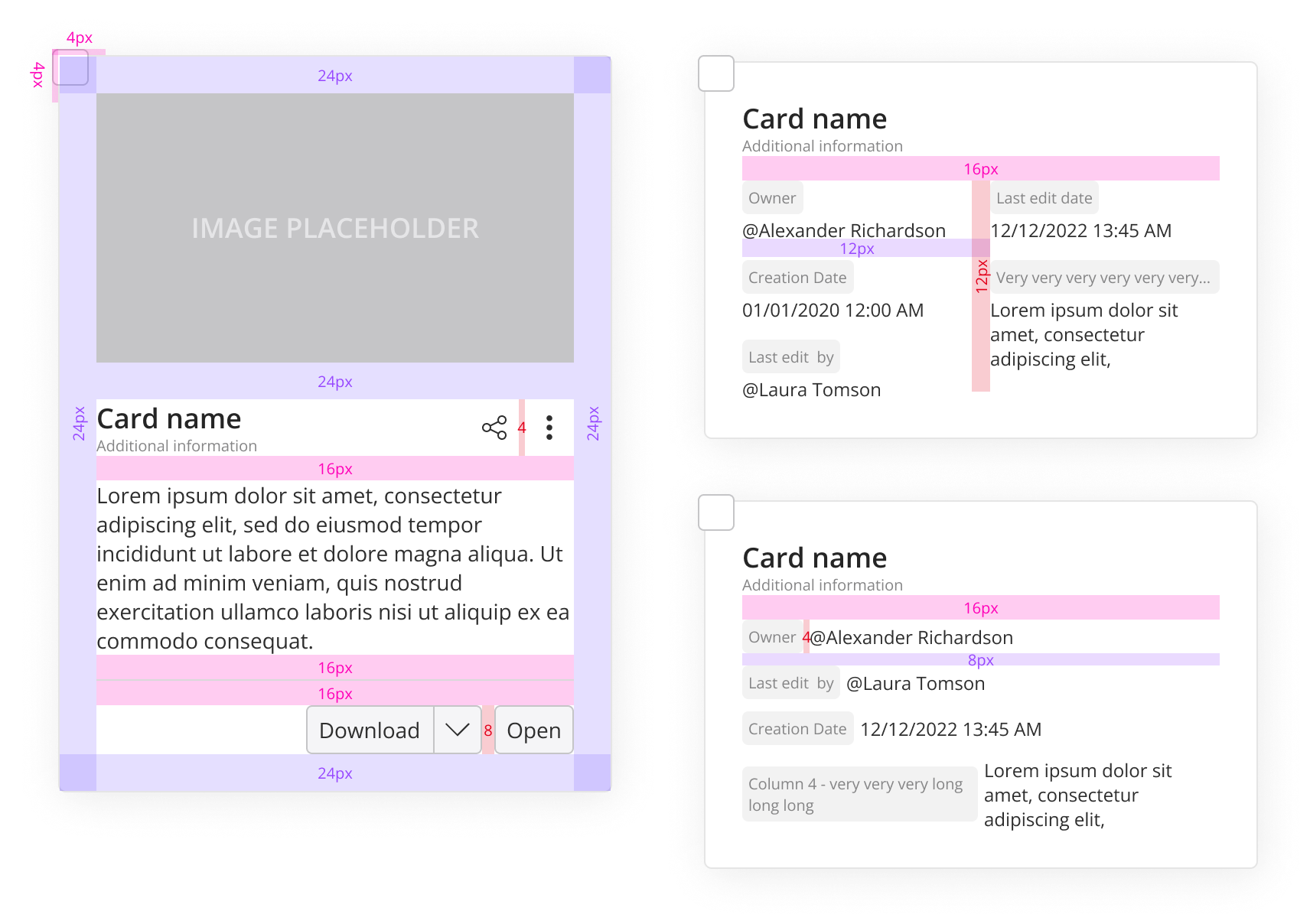
Tile & Card Guidelines
UX guidelines for tiles and cards in a design system
UI Design Design System
Read case study
Tile & Card Guidelines
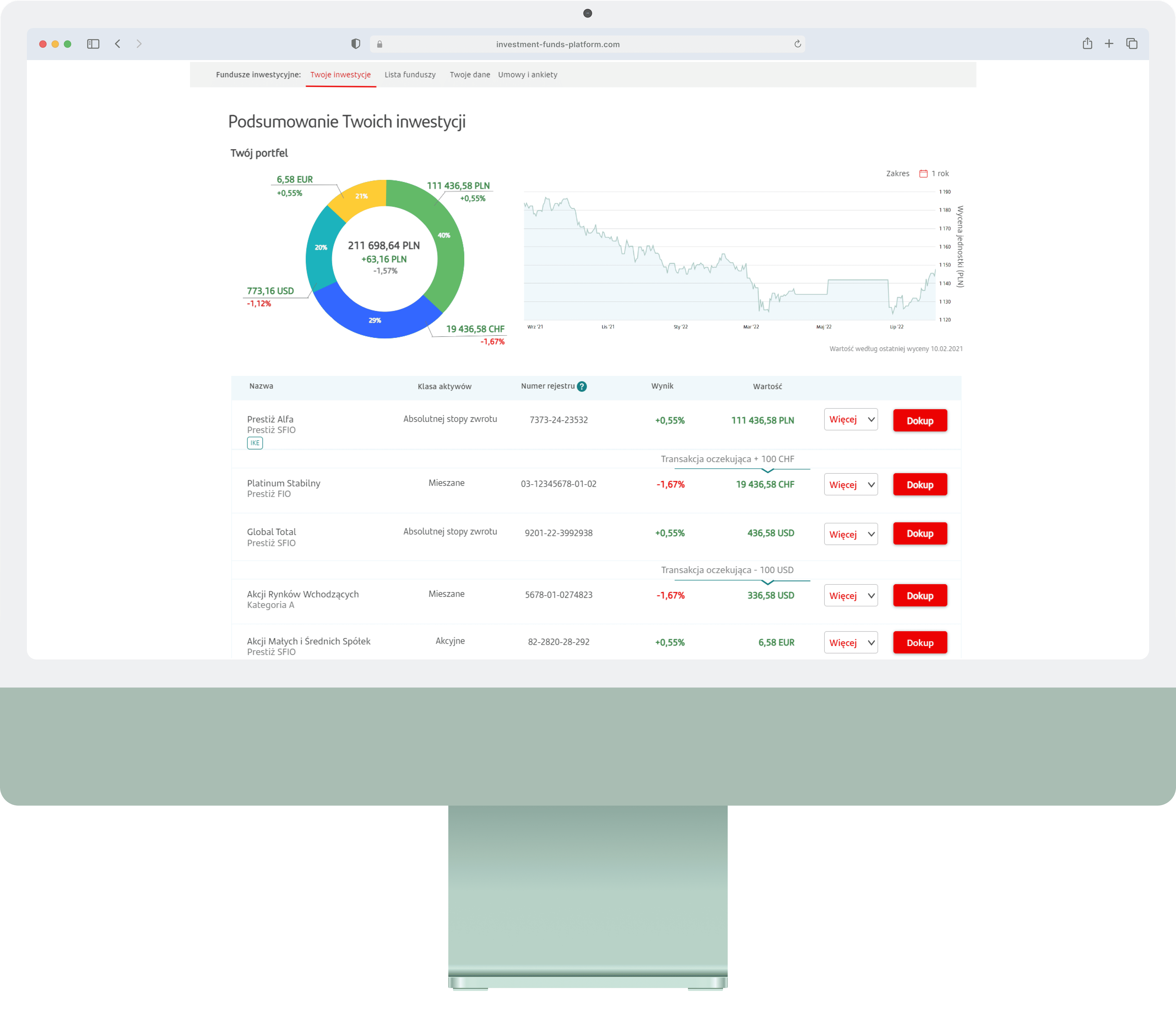
Investment Hub
Simplifying mutual fund investing for ~7.5M retail customers
Research UX Design Prototyping Dev Handoff
Read case study
Investment Hub
User Research on AI Search
UX research study on how users navigate and search in AI-powered interfaces.
UX Research Usability Testing Survey Design Data Analysis
Read case study
User Research on AI Search